


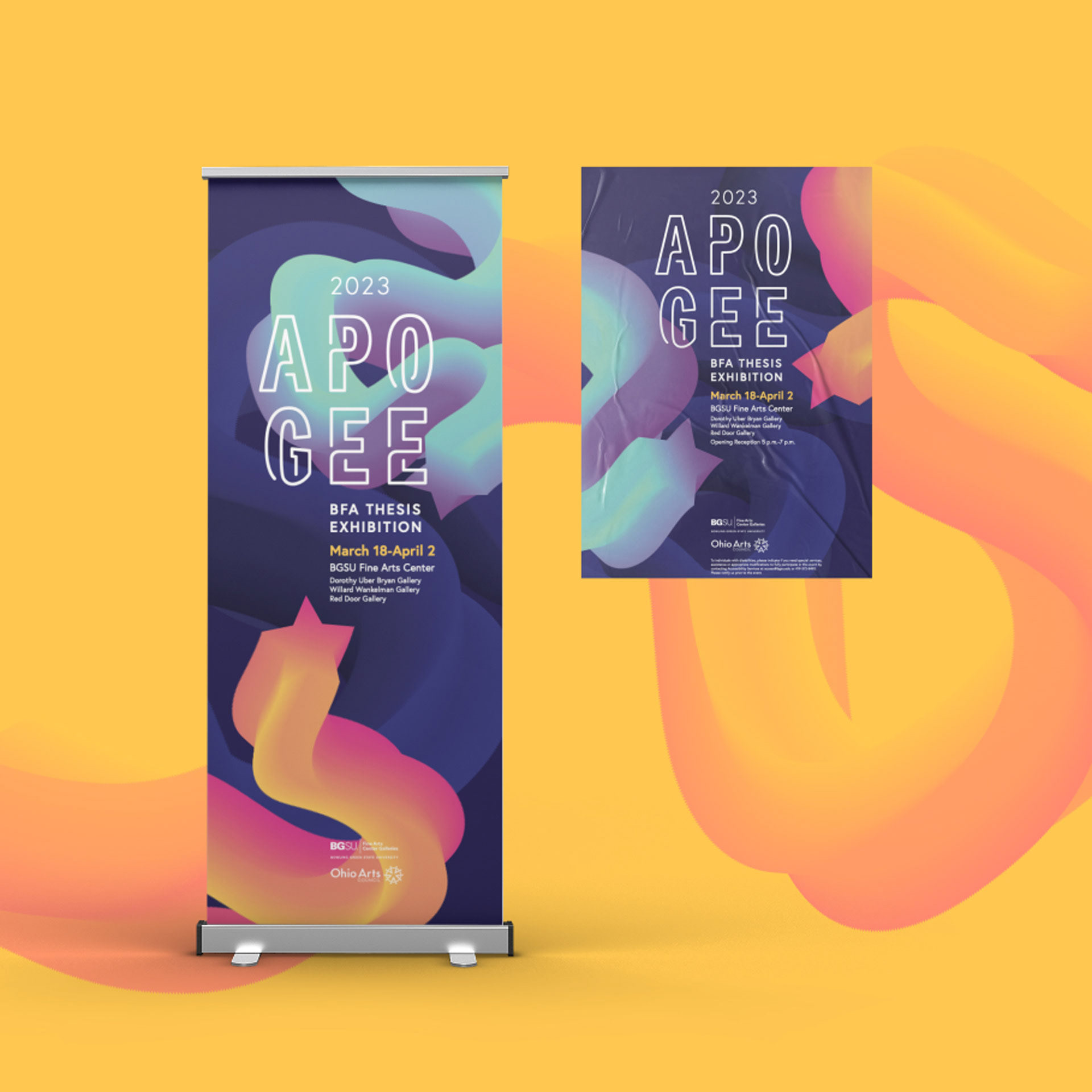
Apogee is defined as the highest point in the development of something, a culmination within a body of work. The show itself serves as a chance for students to display their years of hard work to their peers, friends, and family. Because each student in the School of Art is required to complete a Thesis Project and display it in the galleries, the star shape is utilized to represent each of the five divisions in the School of Art: Studio Art, Digital Arts, Art Education, Art History, and Graphic Design.
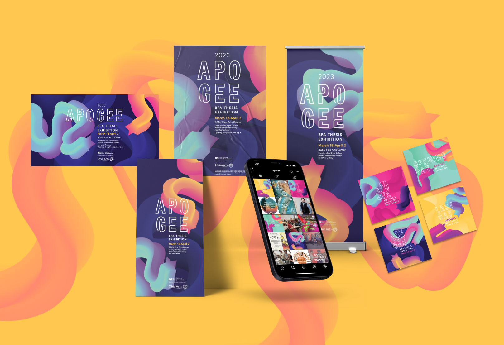


These are then incorporated into gradient forms throughout the branding, representing the journey of obtaining a BFA Degree and making and exhibiting a Thesis Project. Because the work in the show took semesters to complete and was not always smooth going, the curved and interacting lines within the type show the process of creating a thesis body of work. The colors relate back to apogee’s meaning in astronomy, utilizing space colors such as navy, pink, purple, teal, and yellow. These interact with one another within the gradient forms, creating new colors and representing the creative process of making. Overall, the final branding helps to highlight the work done by BFA Students throughout their time at BGSU, signifying an end of an era with a high quality of student work.
RECOGNITION
Bronze ADDY Award

Taylor Petersen | 2024